
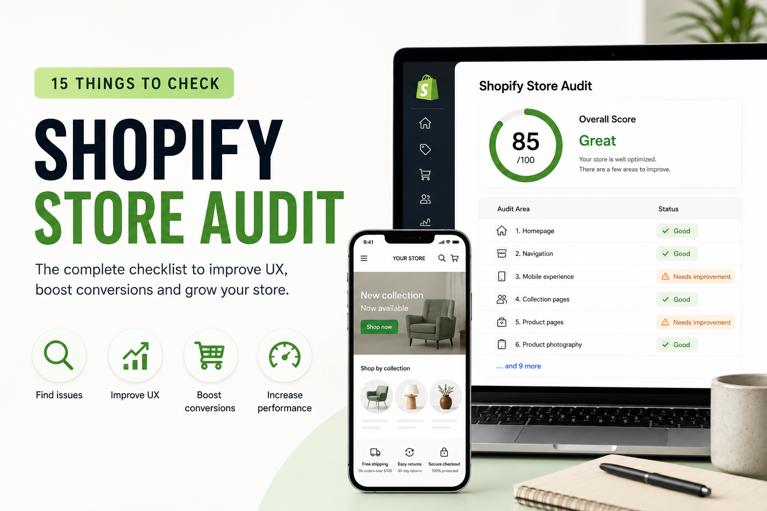
Shopify Store audit: 15 things to check before redesigning your Store
Thinking about redesigning your Shopify store?
Before changing your theme, rebuilding your homepage, or investing in custom development, it’s worth understanding what is actually wrong with the current website.
A Shopify redesign shouldn’t be based only on personal preference.
It should solve problems.
A proper Shopify store audit can reveal where customers are getting confused, where conversions may be lost, and which parts of the website deserve the most attention.
Here are 15 areas we recommend reviewing.
1. Homepage
Your homepage should quickly answer three questions:
What do you sell?
Why should customers choose you?
Where should they go next?
Avoid overwhelming visitors with too many banners, promotions and competing calls to action.
Create a clear hierarchy that guides customers toward your most important products and collections.
2. Navigation
Navigation becomes increasingly important as your catalog grows.
Check whether customers can easily reach important categories without opening multiple unnecessary menus.
For larger stores, consider:
- Mega menus
- Subcategories
- Featured collections
- Visual navigation
- Search
- Filtering
Navigation should reflect how customers shop rather than how your internal catalog is organized.
3. Mobile experience
Your store shouldn’t simply “work” on mobile.
It should be designed for mobile shopping.
Check:
- Button sizes
- Font sizes
- Product galleries
- Sticky add-to-cart
- Navigation
- Filters
- Pop-ups
- Forms
- Cart interactions
Small usability problems become much more noticeable on a phone.
4. Collection pages
Collection pages often receive significant traffic but don’t always receive enough design attention.
Review:
- Product-card size
- Product information
- Filters
- Sorting
- Collection descriptions
- Breadcrumbs
- Pagination
- Quick-add functionality
- Mobile layout
Customers should be able to scan and compare products quickly.
5. Product pages
Your product page needs to answer the questions customers have before purchasing.
Depending on the product, this could include:
- Materials
- Dimensions
- Sizing
- Delivery
- Returns
- Compatibility
- Product benefits
- Care instructions
- Availability
Don’t force customers to leave the product page to find essential information.
6. Product photography
Images are one of the most important parts of ecommerce.
Use a combination of:
- Clean product photography
- Detail shots
- Lifestyle images
- Scale references
- Product videos
Make sure image quality is high without unnecessarily slowing down the website.
7. Calls to action
Important actions should be visually obvious.
Examples include:
Add to Cart
Shop Collection
Choose Size
Get a Quote
Avoid having multiple buttons competing for attention in the same section.
8. Trust signals
Customers need reasons to trust an unfamiliar store.
Useful trust signals include:
- Customer reviews
- Secure payment methods
- Clear contact information
- Shipping information
- Returns policy
- Guarantees
- Authenticity information
- Recognizable clients or partners
Place trust information close to important conversion points.
9. Search
Search becomes essential for large catalogs.
Test common searches yourself.
Does Shopify return the products customers would expect?
Pay attention to:
- Product titles
- SKUs
- Brands
- Categories
- Common misspellings
- Predictive search
For stores with thousands of products, good search can dramatically improve product discovery.
10. Filters
Filters should help customers narrow large collections quickly.
Depending on your products, useful filters might include:
- Size
- Color
- Brand
- Price
- Material
- Product type
- Availability
Avoid creating dozens of filters that customers rarely use.
11. Site speed
Heavy images, third-party scripts and unnecessary Shopify apps can negatively affect performance.
Review:
- Image sizes
- App scripts
- Tracking scripts
- Video
- Fonts
- Custom JavaScript
- Third-party widgets
Don’t install an app for every small feature without considering its effect on the store.
12. SEO
A redesign can accidentally damage existing organic visibility if SEO isn’t considered during development.
Audit:
- Page titles
- Meta descriptions
- H1 headings
- URLs
- Internal links
- Image alt text
- Canonical tags
- Structured data
- Redirects
- Sitemap
- Indexation
Preserve valuable URLs whenever possible.
If URLs must change, implement appropriate redirects.
13. Cart experience
Your cart should make completing the purchase straightforward.
Check whether customers can easily:
- Change quantities
- Remove products
- Review variants
- See totals
- Understand shipping expectations
- Continue to checkout
Cross-sells can be useful, but they shouldn’t make the cart unnecessarily complicated.
14. Checkout journey
Look for anything that could create uncertainty immediately before purchase.
Make sure customers understand:
- Payment options
- Delivery expectations
- Shipping costs
- Taxes where applicable
- Returns
Unexpected information late in the journey can contribute to abandonment.
15. Analytics
Finally, don’t redesign without data.
Review your analytics to understand:
- Most visited pages
- Landing pages
- Mobile vs desktop behavior
- Conversion rate
- Add-to-cart activity
- Checkout behavior
- Traffic sources
- High-exit pages
Combine analytics with UX analysis.
Data can tell you where customers leave.
A UX audit can help determine why.
What should you fix first?
Don’t try to redesign everything simultaneously.
Prioritize issues based on:
Impact × frequency × difficulty.
A small change affecting every customer may be more valuable than a major redesign of a page receiving very little traffic.
Need another perspective?
When you work on your store every day, usability problems can become difficult to notice.
At Lemon.dev, we audit Shopify stores from a UX, development, SEO and conversion perspective.
If you’re considering a Shopify redesign, send us your store URL.
We’ll help identify the areas worth fixing before you invest in rebuilding everything.